HELO
List View Filters
Helo, a subsidiary of Expeditors, is a third-party supply chain visibility tool that ingests data from hundreds of carriers and logistics service providers to provide granular insight into a customer’s shipments, containers, orders, SKUs, and milestones.
Objective: Design an entirely new filtering system for all list-views that solves current user challenges, increases operational efficiency, and enhances the usability of the product.
Design Discipline: UX/UI Design, UX Research
My Role: Design Lead
Context
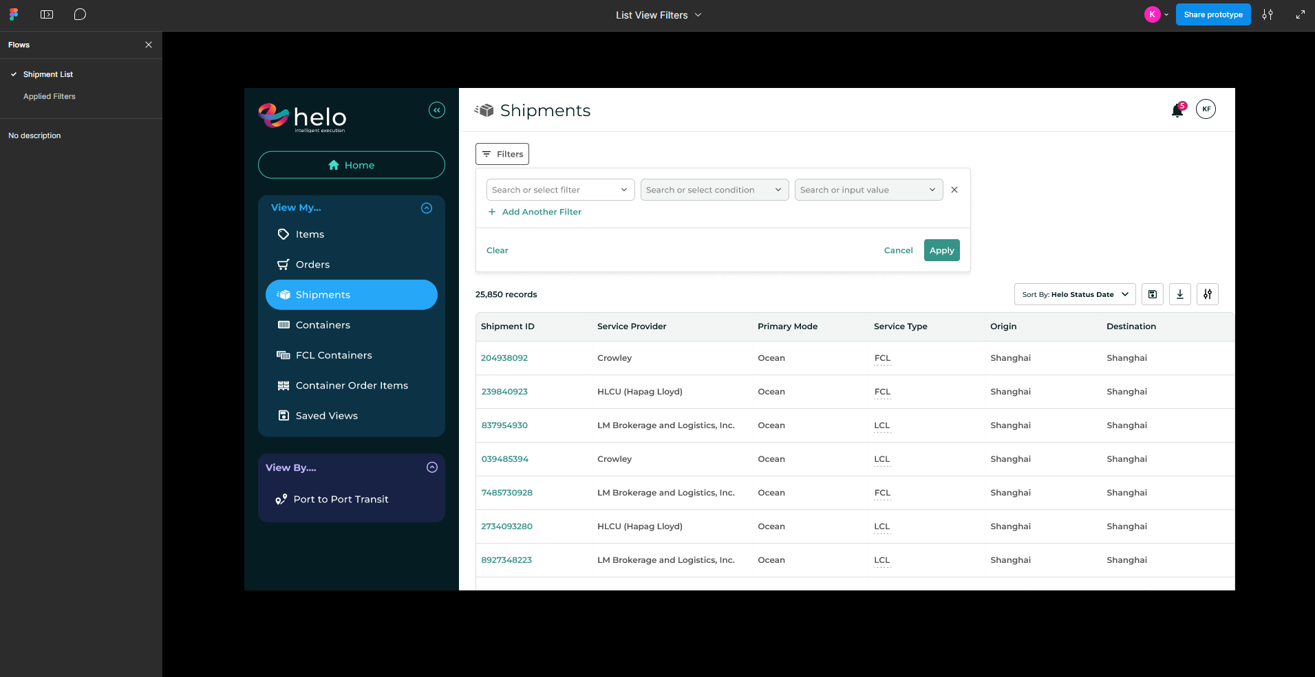
Helo’s previous filtering system was a side-bar filter experience, which users found to be a bit cumbersome when dealing with very large datatables. This filtering mechanism did not support pick-lists, forcing users to manually input all search criteria without the help of type-ahead search or multi-select options.

The Problem
Helo’s previous filtering system was a side-bar filter experience, which users found to be a bit cumbersome when dealing with very large datatables. This filtering mechanism did not support pick-lists, forcing users to manually input all search criteria without the help of type-ahead search or multi-select options.
Ultimately, users needed a way to filter their data more efficiently and in bulk.
Discovery
My design process always begins with the basics: requirements gathering and lots of research.
- Regular whiteboarding sessions with PM
- One-on-one meetings with top users
- Industry research
PROCESS
Design + Document
- Design initial prototype based on preliminary research
- Organize components and document important behaviors
PROCESS
Design + Document
- Design initial prototype based on preliminary research
- Organize components and document important behaviors
PROCESS
Apply multiple filters at once
Users save time and retain context with bulk-add filters and type-ahead search capabilities.
PROCESS
Apply multiple filters at once
Users save time and retain context with bulk-add filters and type-ahead search capabilities.
Fast filter editing
Once a filter is applied, users can interact directly with it without needing to reopen the module or clear the filter.
Pick-list dropdowns & type-ahead search
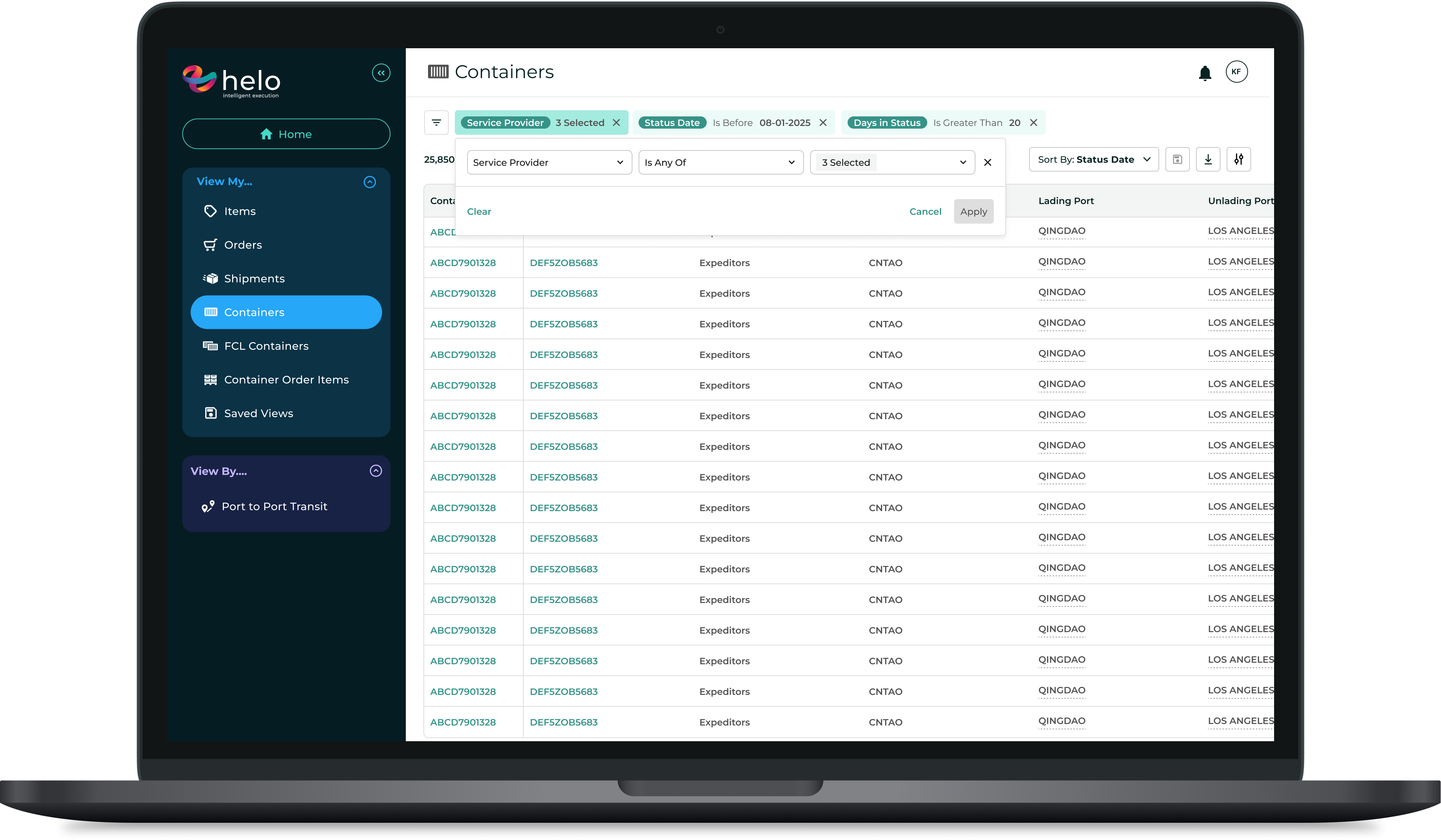
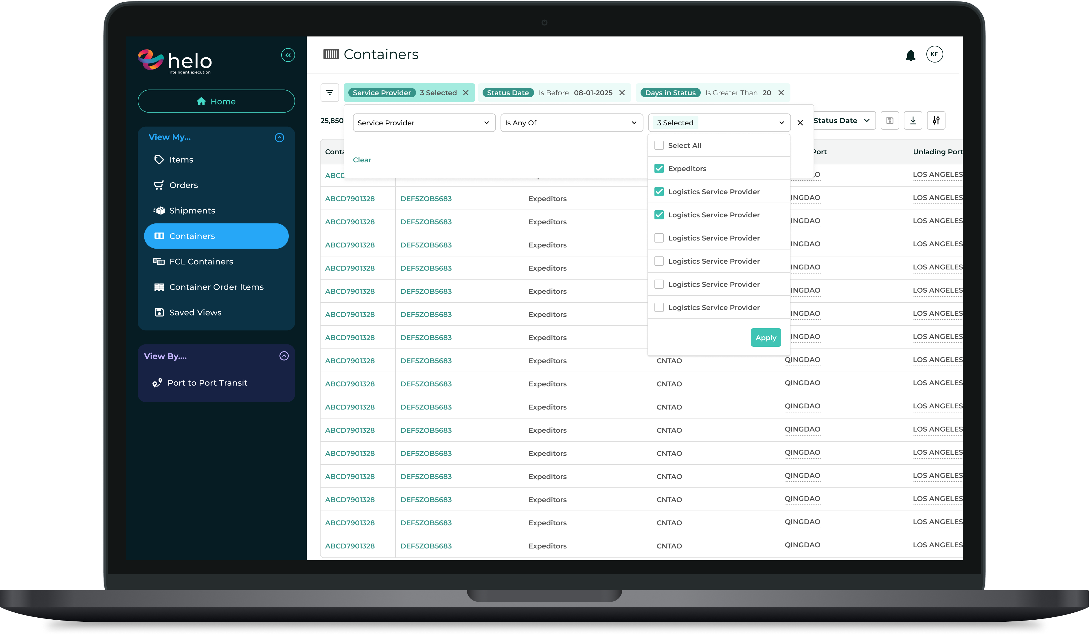
The new “Is any of” operator creates the option for multi-select lists. This has been especially helpful for users looking to filter for multiple carriers, IDs, and ports.
PROCESS
QA
Because we probably shouldn’t test in prod. Even though it’s fun sometimes (kidding! unless…).
HELO
List View Filters
Helo, a subsidiary of Expeditors, is a third-party supply chain visibility tool that ingests data from hundreds of carriers and logistics service providers to provide granular insight into a customer’s shipments, containers, orders, SKUs, and milestones.
Objective: Design an entirely new filtering system for all list-views that solves current user challenges, increases operational efficiency, and enhances the usability of the product.
Design Discipline: UX/UI Design, UX Research
My Role: Design Lead
Context
Helo’s previous filtering system was a side-bar filter experience, which users found to be a bit cumbersome when dealing with very large datatables. This filtering mechanism did not support pick-lists, forcing users to manually input all search criteria without the help of type-ahead search or multi-select options.

The Problem
Helo’s previous filtering system was a side-bar filter experience, which users found to be a bit cumbersome when dealing with very large datatables. This filtering mechanism did not support pick-lists, forcing users to manually input all search criteria without the help of type-ahead search or multi-select options.
Ultimately, users needed a way to filter their data more efficiently and in bulk.
PROCESS
Discovery
My design process always begins with the basics: requirements gathering and lots of research.
- Regular whiteboarding sessions with PM
- One-on-one meetings with top users
- Industry research
PROCESS
Design + Document
- Design initial prototype based on preliminary research
- Organize components and document important behaviors
PROCESS
Validate + Refine
After a few rounds of feedback and iterations, it was time to demo the feature to the whole team and any additional stakeholders on the business side.
Primary goal: Confirm feature satisfies AC and gather any additional feedback prior to dev handoff.
PROCESS
Delivery
After any final refinements were made, the feature was ready for implementation.
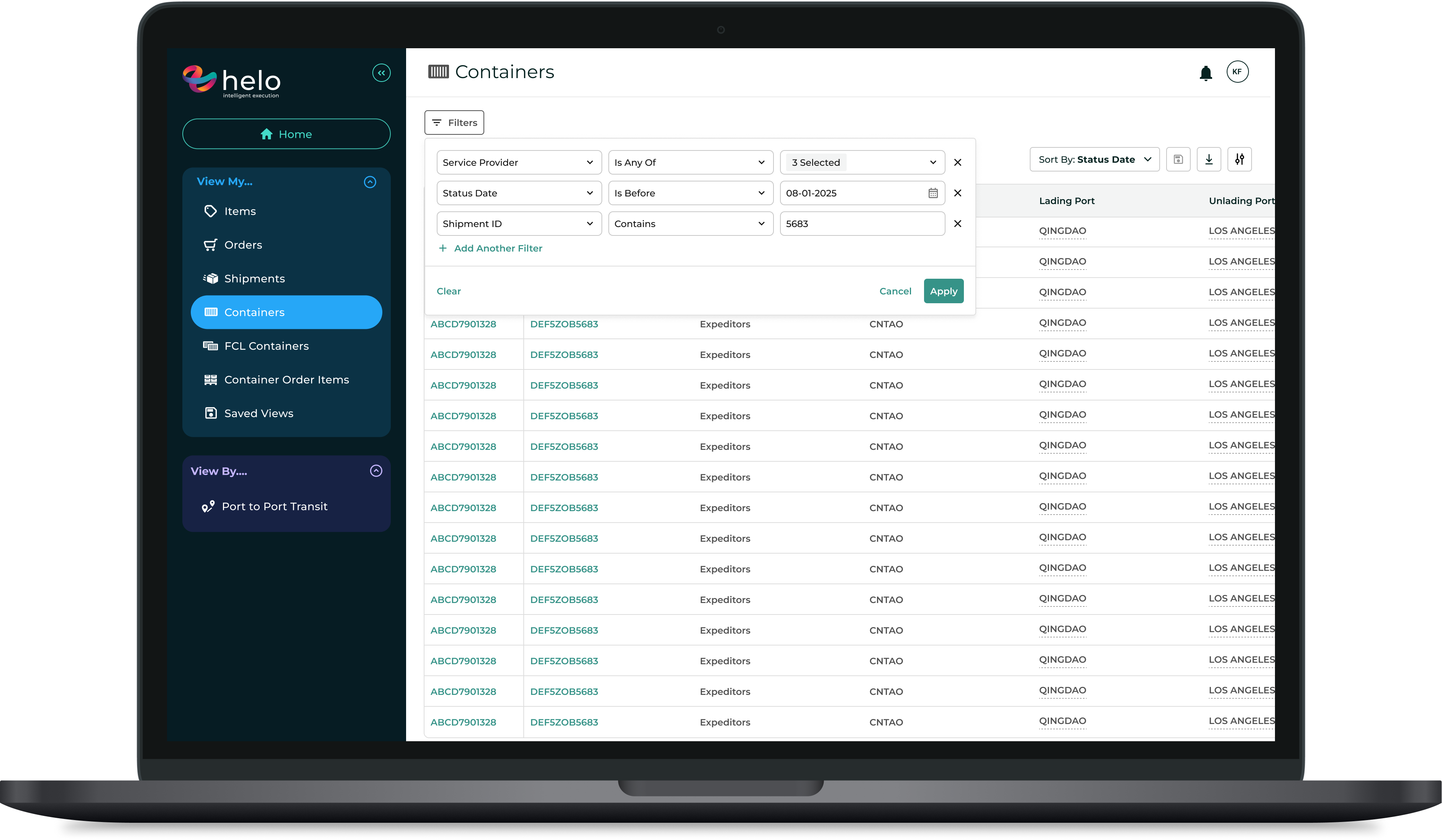
Designed for efficient search, the new filtering module removes the sidebar concept entirely, and offers a module where users can apply multiple filters at once and easily edit them once they’ve been applied.
Apply multiple filters at once
Users save time and retain context with bulk-add filters and type-ahead search capabilities.
Fast filter editing
Once a filter is applied, users can interact directly with it without needing to reopen the module or clear the filter.
Pick-list dropdowns & type-ahead search
The new “Is any of” operator creates the option for multi-select lists. This has been especially helpful for users looking to filter for multiple carriers, IDs, and ports.
HELO
List View Filters
Helo, a subsidiary of Expeditors, is a third-party supply chain visibility tool that ingests data from hundreds of carriers and logistics service providers to provide granular insight into a customer’s shipments, containers, orders, SKUs, and milestones.
Objective: Design an entirely new filtering system for all list-views that solves current user challenges, increases operational efficiency, and enhances the usability of the product.
Design Discipline: UX/UI Design, UX Research
My Role: Design Lead
Context
Helo’s previous filtering system was a side-bar filter experience, which users found to be a bit cumbersome when dealing with very large datatables. This filtering mechanism did not support pick-lists, forcing users to manually input all search criteria without the help of type-ahead search or multi-select options.
The Problem
Helo’s previous filtering system was a side-bar filter experience, which users found to be a bit cumbersome when dealing with very large datatables. This filtering mechanism did not support pick-lists, forcing users to manually input all search criteria without the help of type-ahead search or multi-select options.
Ultimately, users needed a way to filter their data more efficiently and in bulk.
PROCESS
Discovery
My design process always begins with the basics: requirements gathering and lots of research.
- Regular whiteboarding sessions with PM
- One-on-one meetings with top users
- Industry research
PROCESS
Design + Document
- Design initial prototype based on preliminary research
- Organize components and document important behaviors
PROCESS
Validate + Refine
After a few rounds of feedback and iterations, it was time to demo the feature to the whole team and any additional stakeholders on the business side.
Primary goal: Confirm feature satisfies AC and gather any additional feedback prior to dev handoff.
PROCESS
Delivery
After any final refinements were made, the feature was ready for implementation.
Designed for efficient search, the new filtering module removes the sidebar concept entirely, and offers a module where users can apply multiple filters at once and easily edit them once they’ve been applied.
Apply multiple filters at once
Users save time and retain context with bulk-add filters and type-ahead search capabilities.
Fast filter editing
Once a filter is applied, users can interact directly with it without needing to reopen the module or clear the filter.
Pick-list dropdowns & type-ahead search
The new “Is any of” operator creates the option for multi-select lists. This has been especially helpful for users looking to filter for multiple carriers, IDs, and ports.
HELO
Analytics Design System
Helo, a subsidiary of Expeditors, is a third-party supply chain visibility tool that ingests data from hundreds of carriers and logistics service providers to provide granular insight into a customer’s shipments, containers, orders, SKUs, and milestones.
Objective: Create a comprehensive, multi-level design system guide that provides a set of rules for Helo’s analytics solution, independent of the data types being represented. The guide will inform the behaviors, interactions, and UX considerations for all available chart types, and will give a thorough explanation of the underlying query model and data structure as it relates to data visualization.
Design Discipline: Design Systems, UX Research
My Role: Design Lead
Context
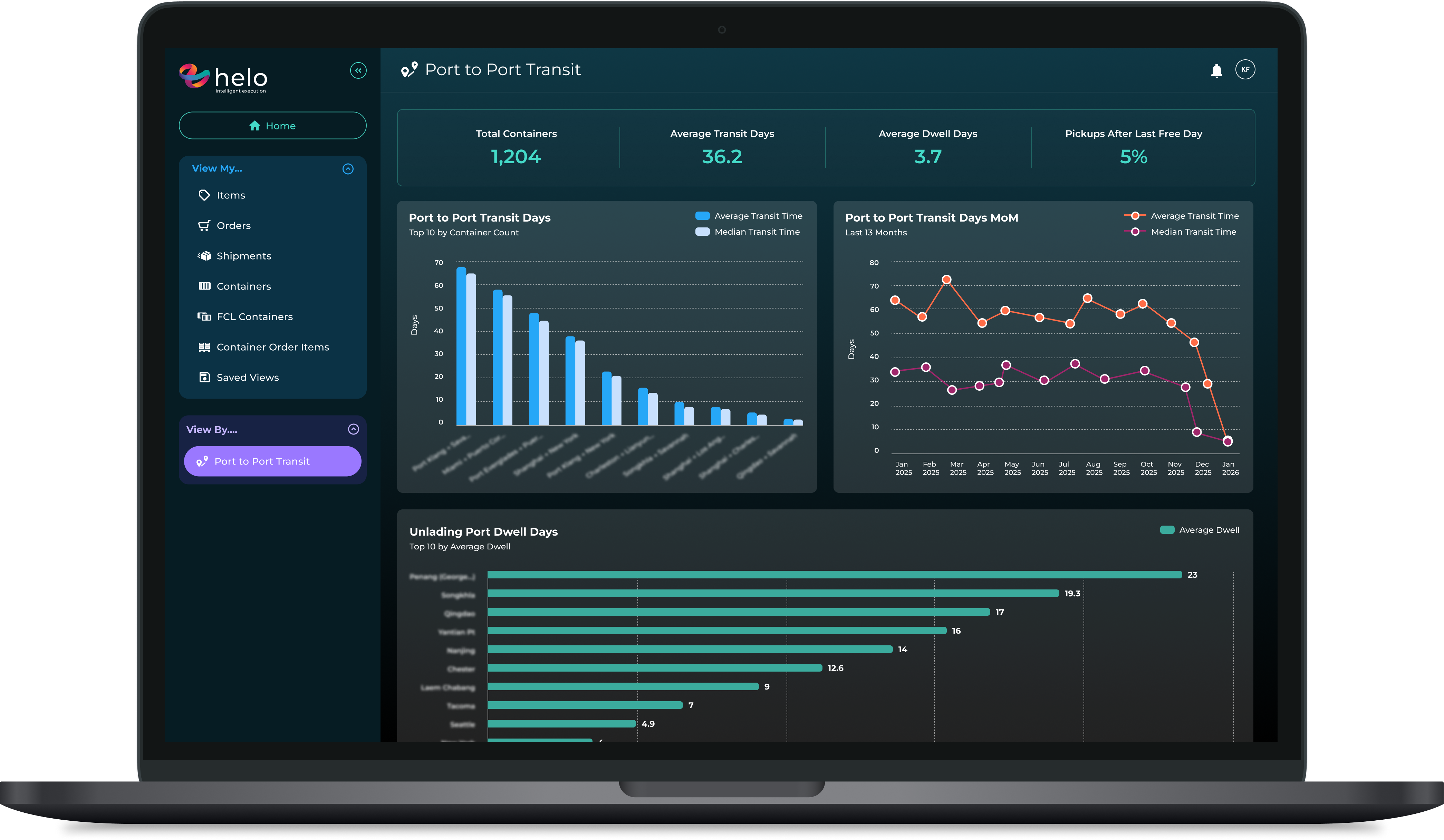
As a way to introduce analytics into our application, our team built a dashboard to visualize Port to Port transit and on-time performance metrics. We explored various chart types, interactions, and visualization strategies, getting direct feedback from a handful of top users along the way.
The Problem
While this was a fully functioning and useful tool, it was designed for a specific use case and didn’t consider the broader analytics solution we wanted to provide for the business long term. Each chart told a specific story of the underlying data, but wasn’t dynamic enough to stand alone without the context of the rest of the dashboard to support.
In order to create a scalable solution that reduces dependencies and ensures a consistent approach for Helo analytics moving forward, there became a need for a standardized design system.
PROCESS
Discovery
The research phase for this effort began with a few key questions:
How do other analytics products in the market work? What do we like/dislike about the experience they provide?
What behaviors and interactions are expected of a chart and/or dashboard?
How do we create a customizable experience for our users within our own defined constraints?
PROCESS
Design + Document
The design system is structured to provide rules on multiple levels: rules that apply to all chart types, and rules that drill down specifically into individual chart types.
On a high level, the guide defines the way charts should work from a UX best-practices perspective, as well as a system perspective. From the underlying data structure and chart anatomy to interactions and color usage, the goal was to establish clear guidelines for designing dynamic components, regardless of the actual data being presented.
On a more granular level, I defined the anatomy and rules that are specific to each individual chart type.
An example of some high-level direction is defining specific grid layout interactions, and answering a few important questions:
- Regardless of what chart types are present in the dashboard, what is the drag and resize experience within our layout grid?
- What is the level of drag/resize customization we want to provide our users so they feel a sense of control over their dashboard layout without compromising the readability of the data?
PROCESS
Validate + Refine
- Walk through V1 of the design system with frontend devs & product.
- Make adjustments based on additional considerations/feedback.
PROCESS
Final Deliverable
The final design system provides a detailed guide for designing dashboards within Helo’s application, as well as lays the foundation for Helo to ultimately become the engine for other Expeditors analytics solutions. Whether a designer is looking to understand the anatomy of a bar chart or the relationship between the query and filtering, the analytics design system serves as the primary source of truth for Helo analytics.
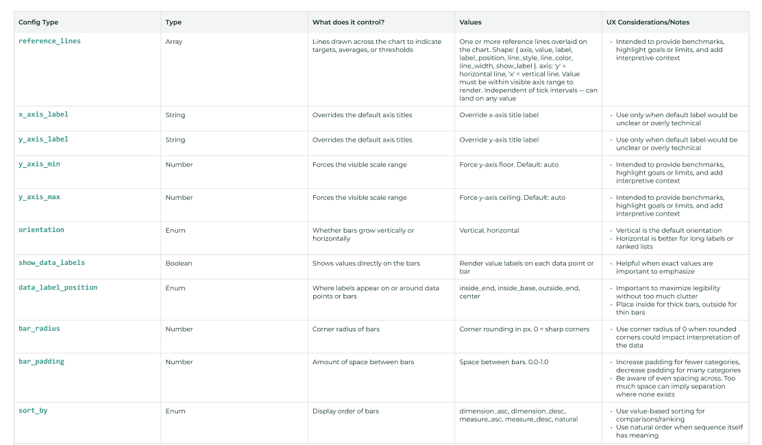
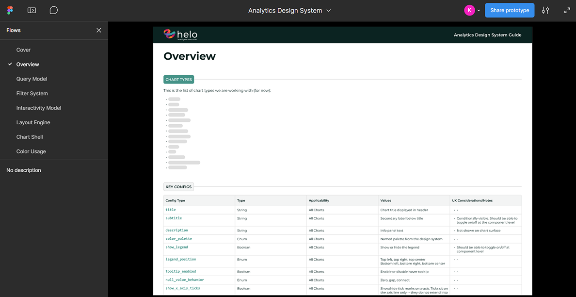
Key configs and UX considerations
The chart config registry is broken out by chart type; giving clarity to what each config is, what it controls, and what to consider when applying it in the design.
Example: Bar chart config registry.
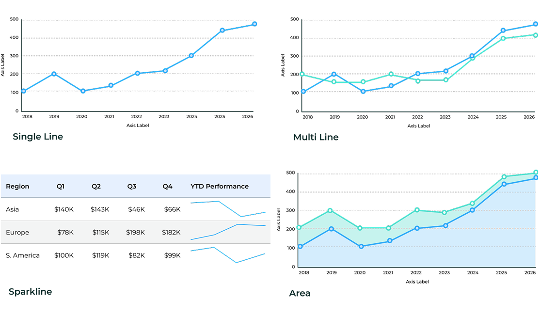
Chart variants and descriptions
Variants are listed and defined by chart type.
Example: Line chart variants.
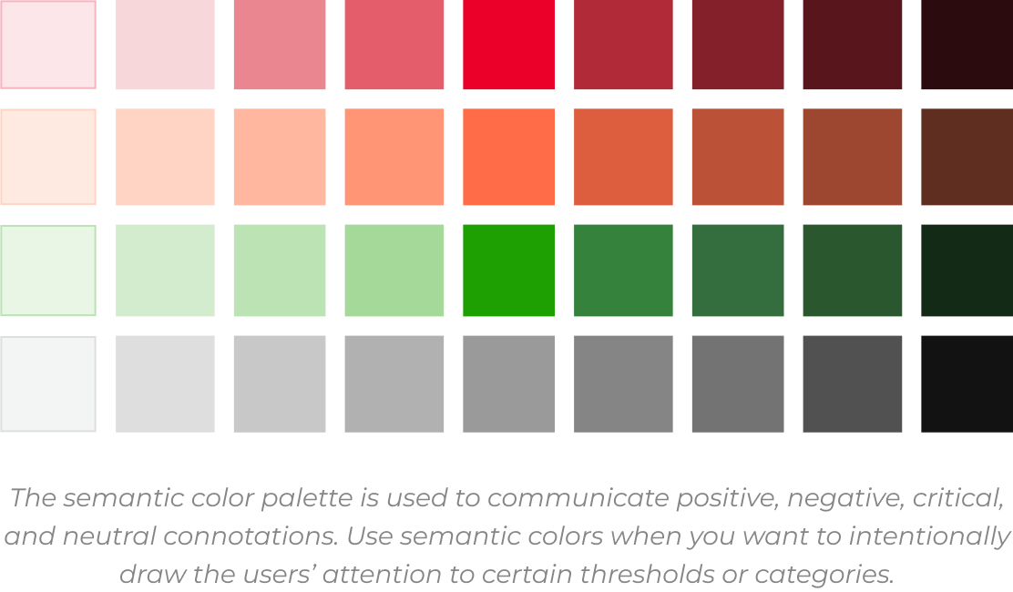
Color usage and visual treatment
From defining the difference between a qualitative and semantic color palette, to explaining the risks of rounding curves, the design system lists out specific do's and don'ts when visualizing data.
"Prioritize legibility over visual comfort," as my PO once wisely advised.
Example: Semantic color palette. AKA: Red="Look over here! It's bad!"